Thursday, June 7, 2012

Principles of Design

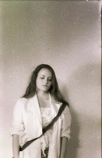
 My principle for this photograph is unity. We wanted our photos to very subtly include the principles so I gave Charlotte a lace shirt and lace umbrella to tie it together. All of the colors are also very soft.

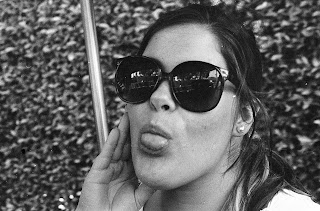
For this photo my principle was contrast. This one is a bit more obvious with Charlotte wearing white and Tia wearing black. With this project we wanted emphasize the fact the the elements and principles of design are present in fashion as well as in all of the things around us. It may be subtle, but we always see it.

Final Project


For my final project I wanted to take more candid, photo journalism-like pictures. I'm not a big fan of set up photographs or photos a deep meaning. I just want to show life as seen by myself and others. For this I used black and white film with my Canon AE-1. I chose these three photos because I felt that they were the strongest because of their composition and moment that they captured.

Wednesday, May 23, 2012

Series


 My idea for my series was to take very up close portraits. The reason I wanted to do this is because many people nowadays take photos of themselves and they make sure they look "perfect" through use of photo editing and filters. When you take up close portraits you really can see every little detail and there isn't much you can hide. It shows people much more naturally. You might not be that close to someone so you can see every little thing, but these portraits show that they are there.

Monday, May 21, 2012

CD album cover

Describe
This is a CD album cover for the album Born To Die by Lana Del Rey. I am standing close to the camera and it looks like I am coming out of darkness. This piece is more figurative.

Analyze 
I wanted really dark tones and contrast. I wasn't really able to get that effect so I used Photoshop to darken the image, darken the background, and add contrast. I am the main subject so I wanted to make sure I was in focus.

Interpret
The album Born To Die is rather dark as you can tell from the name. I wanted to show that through my piece. Death is obviously a common motif throughout the songs so to represent that with a slit throat. I didn't want to shoot someone who seemed like they were actually dead because the title "Born To Die" really makes you think about while you are currently living, you will one day die. I wanted to combine the idea of life and death.

Judge
I believe this image is successful. The composition turned out how I wanted it for once and I believe the meaning was also accurately captured. It seems to me like this could be a real CD cover even a real CD cover for this particular album. 
 

Tuesday, April 24, 2012

5 Interesting Photography Facts

1. Kodak was named after what the owner thought the shutter sounded like.

2. The word photography derives from the Greek words ‘photos’ – meaning light and ‘graphien’ – to draw.

3. The most expensive camera in the world named “Daguerreotype” is 168-year-old and belongs to a US-based scholar and was inherited from his father, a technical photography professor at Munich University. The starting bid is $132,000.

4. Due to the length of exposure time, some photographers employed the use of neck braces to clamp the subject’s head and neck into place.

5. 35mm film was 1st made in the late 1800's.
The first color photograph was taken in 1861 by James Maxwell, the British physicist.Source: http://www.eurogallery.org/news/general-info/interesting-facts-about-the-history-of-photography-50/ @www.eurogallery.orgDue to the length of exposure time, some photographers employed the use of neck braces to clamp the subject’s head and neck into place.
The first color photograph was taken in 1861 by James Maxwell, the British physicist.Source: http://www.eurogallery.org/news/general-info/interesting-facts-about-the-history-of-photography-50/ @www.eurogallery.org

Thursday, April 12, 2012

A Moment In Time

This photo was for a project in which we had to capture a moment that shows our time period, ourselves and applies to our audience. This photo shows Tia on the computer. You can tell that her face is lit by the computer alone. The reason I chose this subject is because our generation is very obsessed with computers and technology in general. We are probably the first generation to be so consumed with technology since we have been around through this huge technological revolution. Many young people and even adults can identify with this. Always using our phones, computers, iPods and now even iPads. And even those who's lives don't revolve around technology have witnessed this. Whether it be their friends or family, technological obsession is very prominent in our society.

Monday, March 12, 2012


Describe
This is a photo of Tia studying with a toy on her back. Lighting was used to make it look like she was studying in a more natural setting. However the background is blank to draw more attention to the subject.

Analyze
This photo has many different elements that contribute to the meaning of the shot. They are all surrounding the main subject to bring you attention in. This image is in focus because it was meant to be a conceptual shot. The shot is meant to look as natural and realistic as possible.

Interpret
This photo is meant to show the concept of being an adult and mature while still holding onto a piece of your childhood. Many teenagers have to deal with the stress of school and studying while we still want to be a kid and to not have responsibilities. This specific shot shows how while you're trying to be mature you still have you childhood following you kind of like it is hanging on your back.

Judge
I think this shot is successful. It is very clear and to the point. The concept is apparent in the shot. The main subject is clear and there are contributing elements to it.

Sunday, January 29, 2012

Lighting Project


Describe
This is a picture of Charlotte using a whit board and north facing light. Additional lighting was used with a lighting sheet which added brightness to the subject. The background is blank since Charlotte's back is facing the board.

Analyze
 This picture is a bit grainy which makes it look like an old photo. The lighting was meant to light not just her face, but her figure as well. 
Interpret.
This lighting is meant to bring attention to the subject. The background gives nothing to distract the viewer. The focus isn't necessarily on her face since you can't see her eyes since she's looking down, but the focus is on her as a whole.

Judge 
I wanted this photo to be much clearer and more focused. It didn't turn out exactly as I hoped, but it still has a nice effect, looking like an old photo. I think it's successful on it's own, but not what I wanted it to be. 


Thursday, January 26, 2012

Lighting with Scrim


Describe
This is a portrait of Charlotte using a scrim. The scrim is used to give a soft light to the subject's face. She's outside so there are trees in the background, but it is not relevant to this figurative piece.

Analyze
This piece has deep tones and soft lighting due to the scrim. This image is in focus and was done one purpose. The point was to capture her face more importantly, her eyes, while using soft lighting to accent her face.

Interpret
This piece is another beauty shot. This type of lighting is commonly used in fashion photography. This is a light image even with the dark, deep tones. Charlotte has a content, airy expression. This was taken outdoors, but the focus is on Charlotte's face.

Judge
I think this work is successful. It has contrast and soft lighting. I think it's one of my more successful photographs.